Trending


James Gardner — 11 Times Square: Fowle’s newest building only fair
<i>Architect tries for imaginative flourishes at tower but falls short</i>

11 Times Square
No one architectural firm has had a greater influence on the current complexion of 42nd Street than what was once the firm of Fox & Fowle. In its glory days around the year 2000, it was responsible for the Condé Nast Building at 4 Times Square and for the Reuters Building, directly across the street at 3 Times Square. Later, Robert F. Fox, together with his new partner Richard Cook, designed (as Cook + Fox) One Bryant Park, the new Bank of America Building on Sixth Avenue.
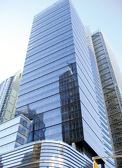
Now there’s the nearly completed 11 Times Square, which Bruce Fowle, going solo as FXFowle, designed for the southeast corner of 42nd Street and Eighth Avenue.
The most original of these projects, at least for its time, was the Condé Nast Building; the best is probably the recently completed One Bryant Park. The newest arrival, from the point of view of design, is the least successful — 11 Times Square, a structure that would look dull in any case but looks doubly so next to the far more glamorous New York Times Building designed by Renzo Piano.
In fairness to 11 Times Square, let it be said that by the same logic, it gains something through its proximity to the Westin Hotel, near the northeast corner of 42nd Street and Eighth Avenue, designed by Arquitectonica. That hotel would make any building look good by comparison. The presence of the Port Authority Bus Terminal, across the street, also serves to enhance the status of the new arrival.
While we’re at it, I have no idea by what legal machination or poetic leap of faith this new building, which is 40 stories tall and contains 1.1 million square feet of office space, comes to call itself 11 Times Square. Developed by SJP Properties, it stands one block away from Times Square, but feels a world away.
The building itself tries hard to come up with some imaginative flourishes but never quite succeeds. Indeed, 11 Times Square feels old on arrival, exactly as the Condé Nast Building seemed so new when it debuted 10 years ago. There is one good reason for both impressions, in that both of these projects have been conceived according to the same aesthetic, as was the Reuters Building. Call it, for lack of a better term, the collage style. It is a derivative of the Deconstructivist style that was and remains a dominant influence on contemporary architecture. But rather than indulging in the severe radicalism implicit in that style, it evolved into an idiom with its own reassuring symmetries and contextual ornaments. In short, it has created the sort of faux-progressive architecture that even a New York developer could embrace, an architecture purged of the distractions and costly irrelevances of a truly active imagination.
The Condé Nast Building, which inaugurated the style, was an original piece of work, surely in the context of New York City.
An irregular mix and match of curtain walls and masonry, for some of us, it has never been an especially lovely or lovable building. Consisting as it does of a sequence of segments and an antenna that looks like a mosquito whose wings have been clipped, it looks as though it has been designed by a committee that could agree on nothing. Or better still, it looks like one of those “exquisite corpses” dear to the Surrealists, in which each artist creates a quarter of the drawing with no idea, until the final result is unveiled, of what his predecessor or successor has done. That, of course, was the point, and charm, of the 10-year-old Condé Nast Building.
But if the method seems to have remained intact at 11 Times Square, the charm is gone. There is one stabilizing constancy in this new project: the use of glass and steel throughout, without the distractions of those masonry passages that marked the Condé Nast Building. Facing south, the façade of 11 Times Square reads as a fastidiously rectilinear wall of glass, rising 20 stories, one that is as dull as anything built in Midtown in the postwar years. But very quickly this impression changes as its mass is coupled to a façade that curves along 42nd Street.
There is something vaguely contextual in the feel of this second component of the façade: It recalls the sprawling marquees that once dominated this stretch of the Great White Way. Though its contemporary credibility is supposed to be enhanced by the brittle-looking flanges that protrude from it horizontally, it is hard to see what purpose, if any, these flanges serve, any more than one can discern a purpose in their deployment across the façade of Skidmore Owings and Merrill’s recent office tower at the southwest corner of Madison Avenue and 42nd Street, 300 Madison Avenue.
Flanges or no flanges, the marquee façade is surmounted by a third component of the building that rises above it like an irregular silo that tilts willfully toward the street. This heads all the way to the top of the structure, 40 stories above street level.
The time will come when this building, despite the present state of the commercial real estate market, will be filled with renters happy enough to be there. And doubtless this building — indeed, any building at all — would be preferable to the dismal parking lot that occupied this corner of the city for decades. (It is nice to know that, even in our present financial circumstances, some land in the Big Apple is too valuable to remain a parking lot.) And yet, there is still good reason to regret that a better building had not arisen at this focal corner of Manhattan, an architectural monument equal in intelligence and beauty to Renzo Piano’s New York Times Building just across the street.